GB – Lending

Greater Bank – Lending Applications

UX & RESEARCH – 2022

Project

 I was required to redesign the entire lending application experience across Personal loans, Credit cards and Home loans. This team worked in an agile format using an iterative epic and story structure. The scope for this project is very lean, meaning an MVP approach is key to complete milestones on time. This meant that as a designer, I had to capture the important steps required for the application process, the data we must collect whilst upholding the aim to achieve an improved user experience aligning to the new design patterns.

Getting to know the product and current implementation

As a first step into the project and a BAU MVP approach, it was important to me as a designer to understand the current processes across lending products for new and existing customers and understand the preset customer journey. I solely conducted a BAU analysis which included creating a test account and going through the journey myself. As I made my way through the journey I mapped out each step, the content, and the data captured throughout each form. This approach helped to understand the process from start to finish and identify first glance challenges and opportunities. The analysis also assisted with presenting the similarities and differences between the lending products. Once complete, key outtakes were noted and shared with the Product Owner, relevant SME’s and BA’s. 

Analysis of user previous research

As the Digital Transformation department had previously conducted research exercises into personal loan applications to discover end-state desirable design concepts and ideas, this gave me a head start into the pain points and jobs to be done by the user to make the application process and smooth sailing and get the user over the line. To do this, mini-workshops were set up to outline the previous research outcomes and understand how they can be used within the next iteration of designs for this area of work. The assumptions were utilized to generate concepts.

Market research

Alongside the analysis of previous user research conducted, market research was conducted to understand current trends in the lending space. The findings presented the requirement to allow access to lending calculators, be clear about interest and competitive rates, and offer an array of products so a consumer can select a product that is right for them. Most providers stress the requirement to abide by responsible lending and do this by guiding users through initial financial assessment and serviceability determinations.

Key findings
      • Familiarity is number one driver of lender choice customers are likely to stick to banks they know and trust, so the likelihood of an existing happy customer applying for a lending product is higher than a new customer.
      • Flexibility is key customers want choices, they want options and the expect lending providers to provide.
      • Don’t leave me in the lurch am I eligible? Am I approved? Did you decline me? Don’t leave a customer guessing, be upfront and honest and guide them through the process.
      • Help me take control customers want to be incharge of their finances right from application stage through to paying back and off loans.
      • Clear expectations up front giving the user the information they require to make their way through an application and be honest about data required etc.
      • Channel preference is driven by experience and the need for reassurance research showed that most customers prefer to apply for a lending product face to face, with web as the secondary option and mobile app lining up as one of the last preferable options alongside on the phone.

Blueprinting

The next appropriate process to execute was a Blue Printing exercise, which maps out the user flow from the start of an application to the end. This process was conducted to align the appropriate stakeholder’s understanding of the process and identify areas of the flow where improvements could be made. The main areas of improvement included bringing the selection of product, the reason for loan, and loan amount to the beginning of the process.

Identified opportunities

  • Inform customers why we ask for information, be upfront and let them know in advance what to expect.
  • Simplify terms and conditions so the user can understand and more likely to consume the information. 
  • Move choosing an amount and product to the start of the flow instead of making the customer complete a full financial assessment before having the ability to play with amounts, terms and product types within a calculator.
  • Guide a customer through the financial assessment. The current process is very linear without movement for navigating back to previous screens or save and resume for later if they do not have the information to hand. 
  • Simplify the financial forms and identify values that are applicable to the individual instead of presenting a full form with irrelevant fields.
  • When the user is ready to submit, allow them not only to review but to edit the information provided including the loan amount, personal details and financial assessment details. 
  • Once the application has been submitted be upfront about the next stages of the process and allow the customer to have access to contact the lending department.
  • Throughout the application the ability for the system to automatically save information the user enters.
  • Allow the customer to have help through the process, whether that is through online chat or with contact details available.

Ideation and low-fi prototyping

Untitled design-12

A financial hub was designed to break down each part of the process and identify monthly totals/totals for each part of the flow. This hub allows the user to ‘choose their own adventure’ meaning there is no first or last step and the user can complete as they please. Every time a user completes a flow, the icon on that particular flow indicates that the step has been completed with a green tick.

Untitled design-15

Past research presented the requirement to help users make their way through the financial assessment. At present, the application includes long forms with inputs that may not be relevant to the user. The concept of introducing a selection board to help filter out steps in the flow could help assist the user by presenting a form with inputs relevant to their personal situation.

Customers want to know why we ask for data, what its used for and be prepared when going through an application process. Introducing ‘intro’ screens allows the customer to have an overview of what’s to come and understand why they need to complete it.

Informing and being transparent with users around what happens next and what to expect is tackled at the application submitted screen. This step has been designed to give confidence to the user that their application has been submitted and what to expect next. In addition, the opportunity to also contact a lender directly at this stage for questioning.

A desirable functionality to introduce to the lending application flow includes the ability to save an application that is partially completed and resume once ready. This functionality had not been explored within other areas of the new redesign of the banking app, therefore a light touch approach was designed.

I ran a workshop with the research team to get them up to speed with what the team have been working on and address key feedback and questions highlighted by various stakeholders during design reviews. This helped to set the scene and strive as a team to create research objectives lined up for the next round of scheduled research. The questions included:

  • Should we educate the user about our product types or assume they have done their research/leave it up to the lender for them to decided? do we need product selection for type of personal loan or let the lender advise
  • Is an in app calculator desirable? or is the marketing website calculator sufficient
  • What can we do to improve the financial assessment hub? progress indicators, notifications of pending/incomplete states
  • Do users find the selector screen useful? or is it easier to have a full list available and complete the relevant options
  • Does a user want helpful contact throughout the application? would an online chat or phone number help  with completion
  • What communication does the user expect once the application has been submitted? future service mapping

User testing prototype with Figma testing with 8 users.

Summary

– The lending inquiry experience was considered quite easy and straightforward overall, matching or beating participant expectations.
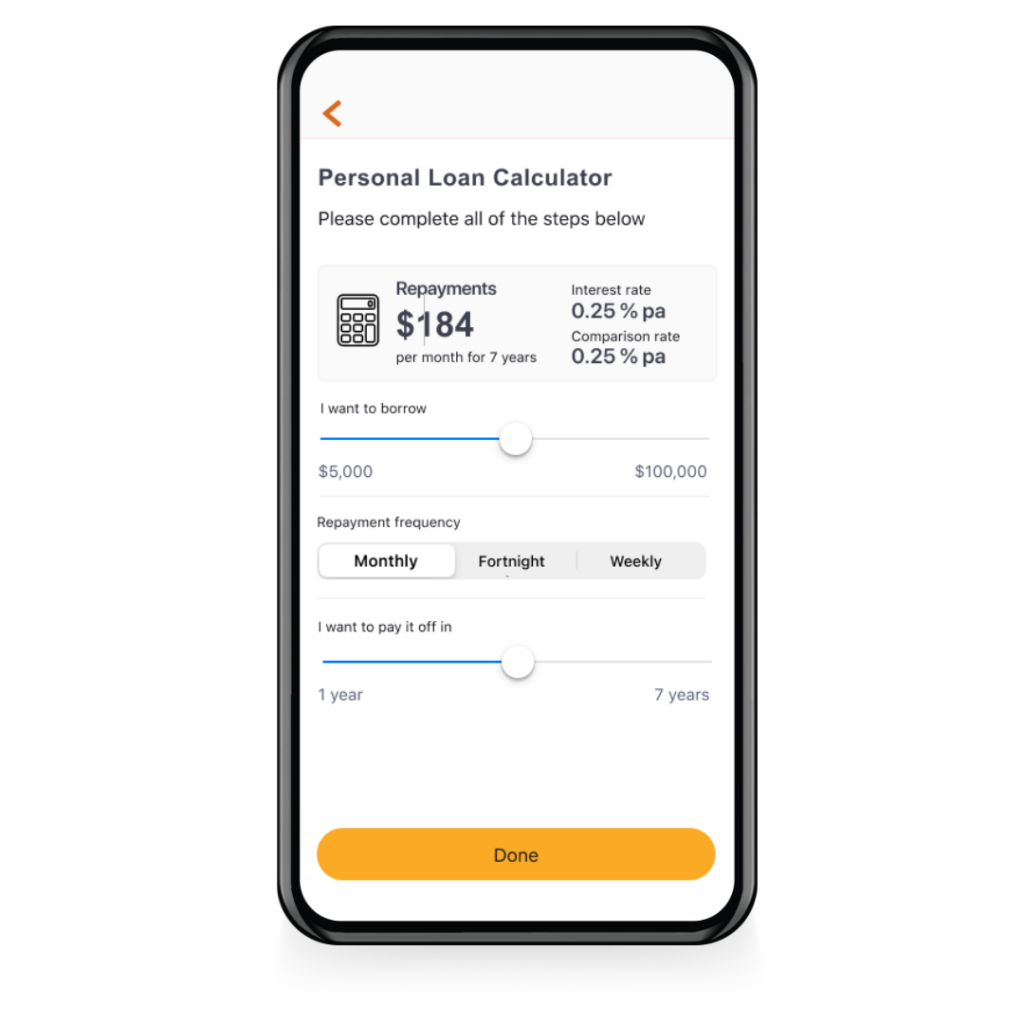
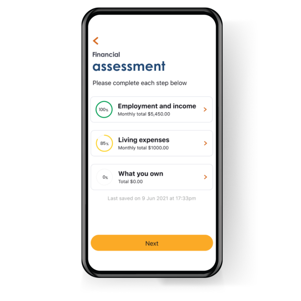
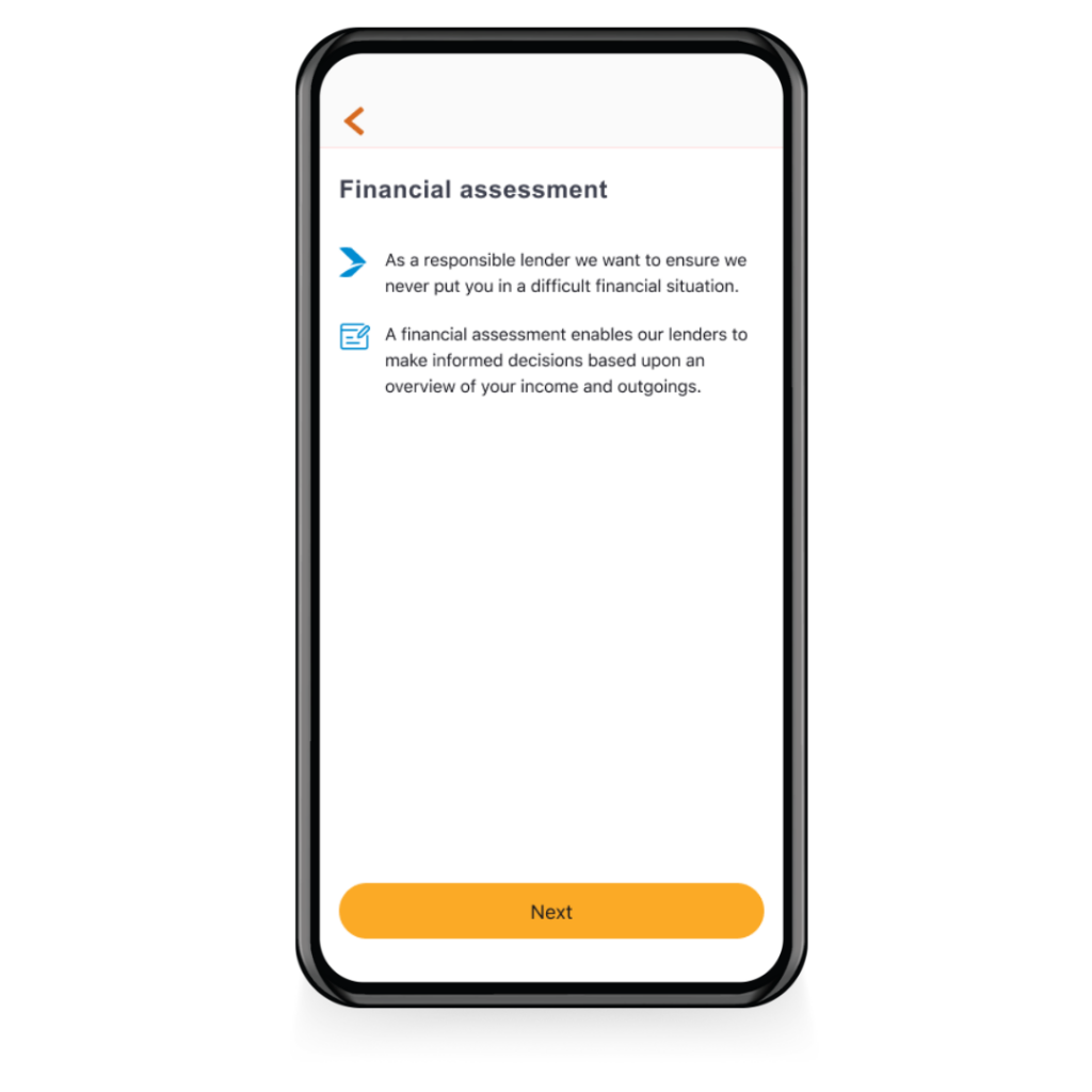
– The in-app calculator and financial assessment hub had the most positive feedback.
– Progress indicators and hints on each screen how to complete actions assisted the users successfully.
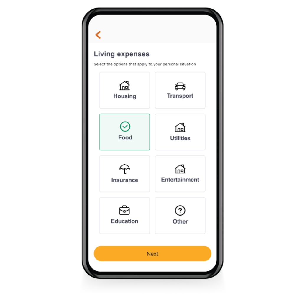
– Filling details for a financial assessment can be intimidating for many users, so any features to guide them without over-simplifying (pre-filling details wherever possible, options to break down expenses further when required, easily calculate salary for time periods, etc) should create a better experience.
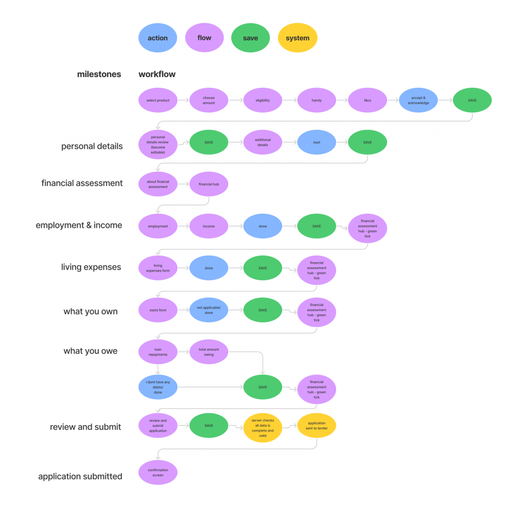
– Save and resume functionality will be a basic requirement, as many users may be unable to complete a full application

“It had everything that I guess I need to put in to make sure I can get this loan. There weren’t any curveball questions or anything I didn’t anticipate or understand. Very straightforward. I couldn’t think of anything else to change or add to it or remove from it.”User interview participant


View full prototype here


Iterations to create MVP solutions for lending product applications that align with both business requirements and user experience/research findings was created in collaboration with the Product Manager and Lead Developer. The end-to-end experience has now be built and will be released to users on migration date.