Travel Bee

TRAVEL BEE

UI / UX web DESIGN – 2018

Meet TravelBee, an accommodation booking site that is primarily targeted at the backpacker consumer group. This booking portal will aim to take booking accommodation to new levels by including enhanced travel booking orientated features inside a sleek, easy to use and simplistic design that is tailored specifically to the users needs and requirements.

MY ROLE

Create a transactional and functional prototype that could competitively enter the market with a strong USP. Thorough qualitative research including a competitive market and conduct user interviews with the target audience to analyse opportunities. The prototype must be tested through user testing with the target user and any design/functionality errors/improvements are to be recognised and altered. A full annotation for developers must be created including a site map.

RESEARCH

MARKET & USER RESEARCH

I began the research by identifying key competitors in the travel backpacker industry and observing their booking sites by acting as a user and performing primary booking actions. The competitive scope in this industry appeared to already be of a high standard, and as a new business entering the market it is crucial to obtain unique selling points and a strong user focused design that will entice transactions and user loyalty. Understanding of the main functionalities vital for this type of site was acquired, alongside visual and structuring inspiration was gained from this analysis.

The competitive research was utilised to formulate scripts and determine the user audience to be recruited for interviews. Once the interviews had be completed, transcribed and the key findings were analysed and established two key personas were formulated. These key personas identify the major personality traits, behaviours and goals within this particular type of travel booking industry. 

USER PERSONAS 

user needs & pain points

By gaining an in-depth understanding of the opposite ends of the backpacker spectrum, I was able to identify who would be interacting and using the booking portals and generate ideas to create solutions for both types of backpackers. 

The personas shared interest in travelling and receiving the best value for their money, alongside a heavy desire for an easy to use and flexible booking system with strong aftercare. However, each of their personal ideas of good travel experience and organisation levels differentiates substantially and their needs require different levels of filtering and searching, organisation and online assistance. The user findings indicated an importance to put a heavy focus on a ‘less is more approach’ by simplifying content and a strong use of imagery and identifiable icons. The timescale of the entire booking process was also highlighted as a very important factor. 

In order for users to choose this particular booking site over competitors, the process to find the most suitable accommodation that fits each requirement must be a seamless experience through implementation of filtering and search options. Additional secondary functionalities also need to be considered to stand out to these types of users. It is also important to incorporate social media as the findings reveal these platforms can make a huge impact on the level of user engagement.

I began by mocking up design ideas in Adobe XD by following customer flows to piece together how a user would visually interact and action each functionality. A combination of the research results indicated a strong focus on imagery, a less is more approach with content and high speed booking portals. I  ensured that these findings were always at the center of each design decision when creating the low-fidelity wireframes. These wireframes were then developed further into an interactive prototype using Axure. 

USER TESTING

– Executive Summary

– Scripted recorded user testing of prototype

– Analysis, overview and recommendations from user outcomes and feedback

– Edited and updated prototype based on main outcomes

– Completed Annotated prototype ready to be passed to developers

– Full Site Maps

USER TESTING KEY FINDINGS

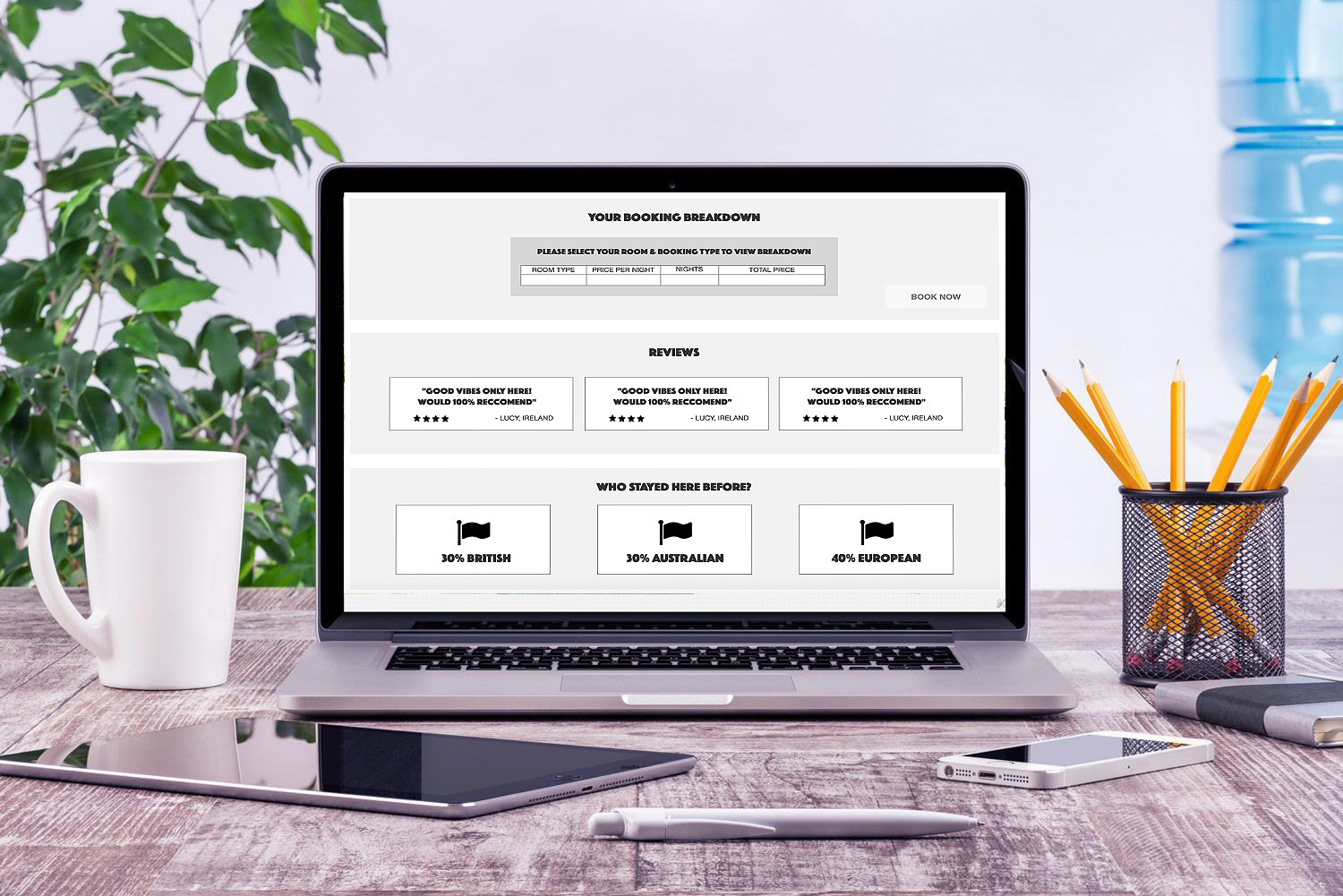
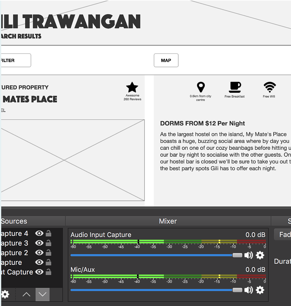
Visuals: Users really liked the high usage images throughout the prototype. The structure was described as easy and simple to navigate on multiple occasions whilst testing each user.

Content: The assumption that the content did not need to be lengthy, and instead broken down and simplified was proven correct from the user feedback. The feedback indicated that the simplified content and similar structuring throughout the prototype was favourable and allowed ease of navigation and familiarity. The users enjoyed browsing the additional functionalities and commented their approval.

Functionalities: User testing indicated that some pages/pop ups were not designed efficiently enough for the users to complete tasks successfully. The user found it difficult to locate buttons and icons as they were not visually aligned. These errors predominantly occurred on the Member Portal homepage whereby users found it difficult to identify the edit and save functionalities and had difficulties understanding and locate the Account Settings icon. However, in regards to basic primary functions the users were able to utilise and action successfully.

Alterations: Identified issues were addressed and changed accordingly. This included both functionality changes and visual alterations. Further to these alterations, additional features and amendments were identified to be altered at a later stage. As the primary functionalities worked correctly with only minor adjustments, these changes will be made after the initial launch.

UI VISUAL MOCKUP

Using Adobe XD, I whipped up a visual of the main homepage to give a initial representation of the intended visual design direction.

This design is a simple, image orientated and clear simplistic approach. The structure and typography usage have been chosen to ensure clarity when reading and find information quickly.

Further alterations will be made at UI design stage to the navigation and logo branding sector to enhance overall appearance.